

UX Review · Audience Research · SEO/GEO Audit · Concept Design
Strawberry Field is a Salvation Army-run visitor attraction in Woolton, Liverpool — the childhood haunt of John Lennon, immortalised in the Beatles song. It reopened in 2019 as a heritage attraction with an interactive exhibition, peaceful gardens, café, and shop, raising funds for the Salvation Army's supported employment programme for young people with learning disabilities.
Despite a globally recognisable name and a genuinely compelling experience, the site was struggling to convert web visitors into ticket buyers. I was brought in to identify why, and what to do about it.
THE CHALLENGE
Curiosity wasn't converting, and the site wasn't helping
Curiosity wasn't converting, and the site wasn't helping
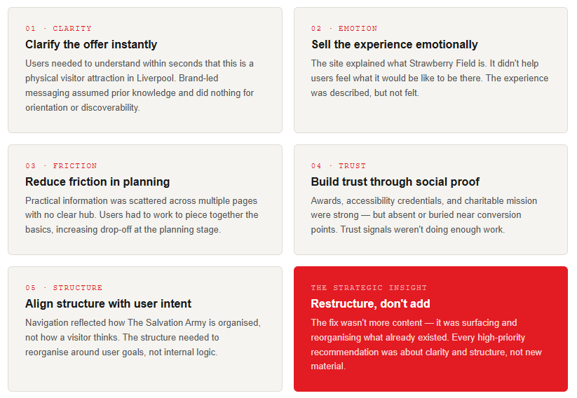
The problem wasn't awareness, Strawberry Field has the Beatles behind it. The problem was that once people arrived on the site, they couldn't quickly work out what it actually was or whether it was worth a ticket.
- The homepage assumed prior knowledge — it didn't establish itself as a visitor attraction within seconds
- Practical information (opening times, what's included, how long to visit) was scattered and hard to find
- Navigation was built around the organisation, not how a visitor thinks
- The emotional promise of the place — stepping into somewhere Lennon once played — was almost entirely absent from the digital experience
- Social proof and trust signals were weak and buried
The core question: how might we better convert curiosity into confident visits?
THE APPROACH & RESEARCH
Grounding every recommendation in real user behaviour and real user sentiment
Grounding every recommendation in real user behaviour and real user sentiment
1. Multi-source evidence base
To avoid recommendations based on opinion alone, findings were built from five sources: an expert UX review benchmarked against comparable attractions; a Hotjar intercept survey capturing live user intent and clarity scores; SEO and GEO auditing across all key pages; Google Analytics behavioural data; and audience persona development across four visitor types.
2. What the survey told us
25 live site visitors completed the Hotjar survey. Average clarity score: 4/5 — but with a notable cluster of 3s. Average visit likelihood: 3.8/5. Beatles interest was the primary motivation for over a third of respondents, yet the site's emotional connection to that story was almost invisible above the fold. Nearly half said they were actively planning a visit but weren't finding what they needed to commit.
3. Audience personas
Four distinct audience groups were defined: Beatles enthusiasts (heritage and authenticity focus); tourists and day visitors (practical information and booking confidence); families (activities, duration, suitability); and mission-led visitors (charitable impact). Each had distinct entry points, questions, and conversion barriers that shaped the recommendations.
KEY FINDINGS
Five consistent themes across all evidence sources
THE DELIVERABES
Strategic direction and a clear implementation path
Strategic direction and a clear implementation path
Prioritised UX Backlog — 33 recommendations
A prioritised, insight-led backlog across the main site and booking modal. Each item included a user need, recommended action, estimated effort, and rationale. High-priority items focused on homepage clarity, planning friction, CTA consistency, and booking confidence. Quick wins (low effort, high impact) were called out explicitly to support phased implementation.
Concept mock-ups — Homepage and Plan Your Visit
Directional redesigns for the two highest-impact pages, illustrating restructured hierarchy, visitor-led framing, clearer calls to action, and stronger emotional storytelling. Presented as directional concepts to guide the development team, not final designs.
SEO and GEO Audit
A page-by-page audit covering traditional search performance and emerging generative AI / GEO visibility. Seven areas of improvement identified across all key pages, from title tag updates and schema markup to repositioning the exhibition page for high-intent search queries. All key SEO recommendations were integrated directly into the UX backlog.
THE OUTCOME
A measurable uplift in conversions and a clear roadmap for continued improvement
A measurable uplift in conversions and a clear roadmap for continued improvement
Following implementation of the recommendations, Strawberry Field saw a 7% increase in website conversions year-on-year. The prioritised backlog structure meant changes could be rolled out in phases — quick wins first, more complex improvements planned into the roadmap — without disrupting the live site or requiring large up-front investment.
“What stood out most was the depth of thought behind every recommendation...nothing felt generic or theoretical. Gemma took the time to understand our existing structure, constraints, and priorities, ensuring that every suggestion was practical, achievable, and grounded in reality. This meant we could implement changes quickly and with confidence, delivering maximum impact without unnecessary disruption.
Beyond the immediate improvements, Gemma also identified and clearly scoped longer-term opportunities and more complex investments, making it easy for us to incorporate them into our roadmap.”
STRAWBERRY FIELD, THE SALVATION ARMY
If you're doing exciting things and need help with anything user experience related, I'd love to talk.